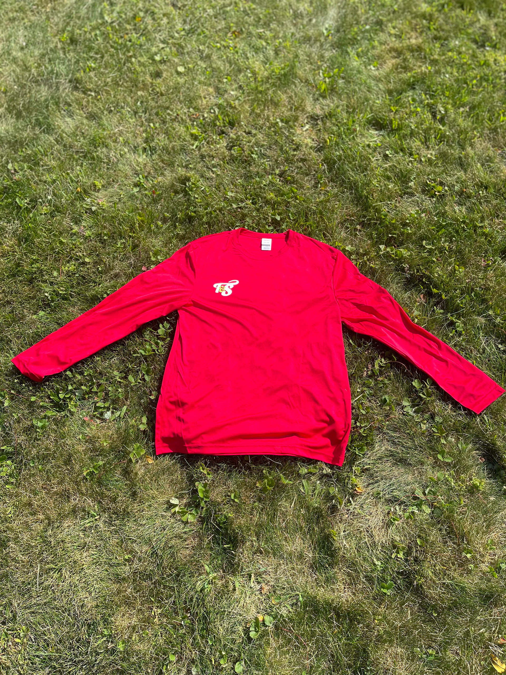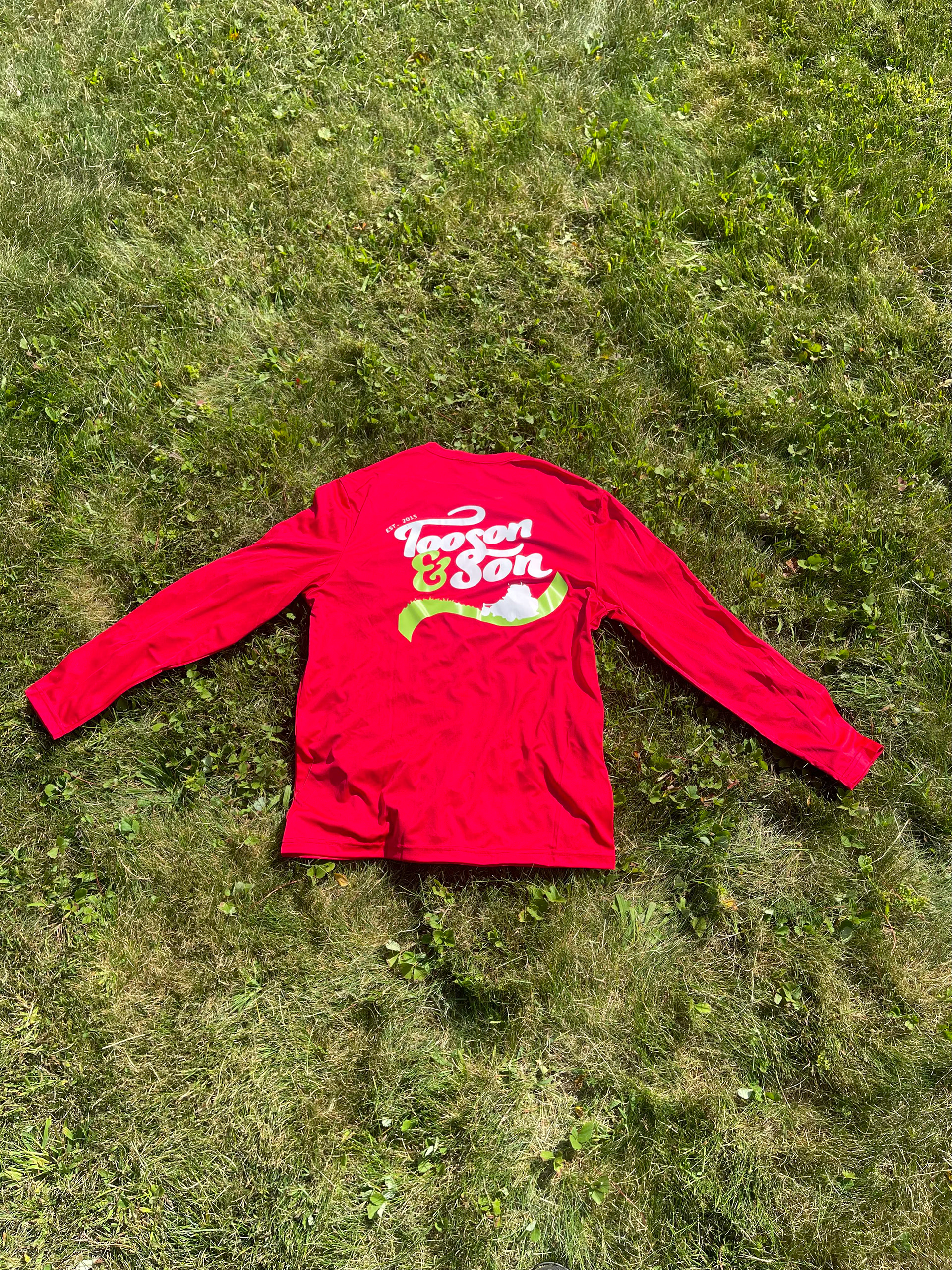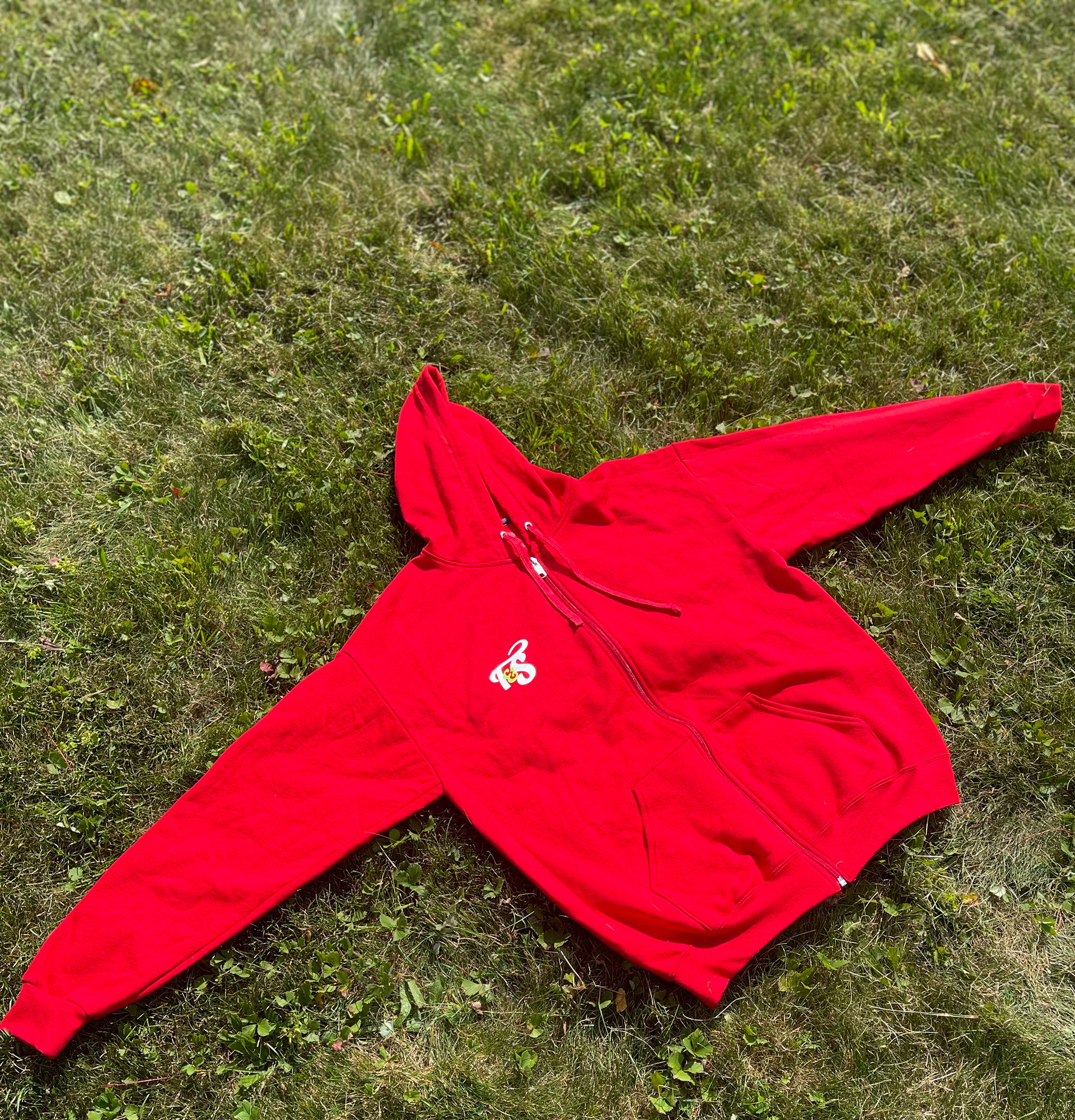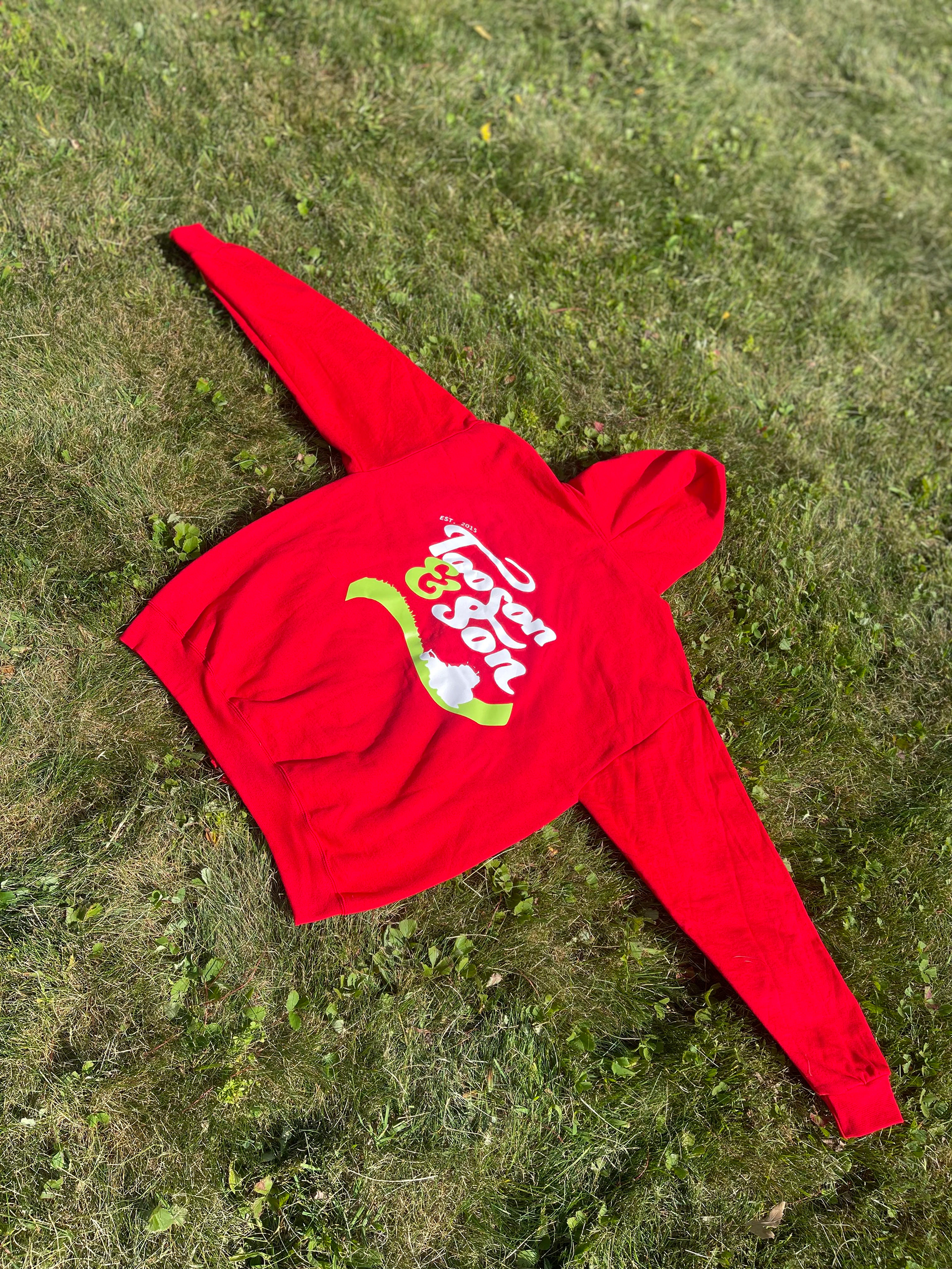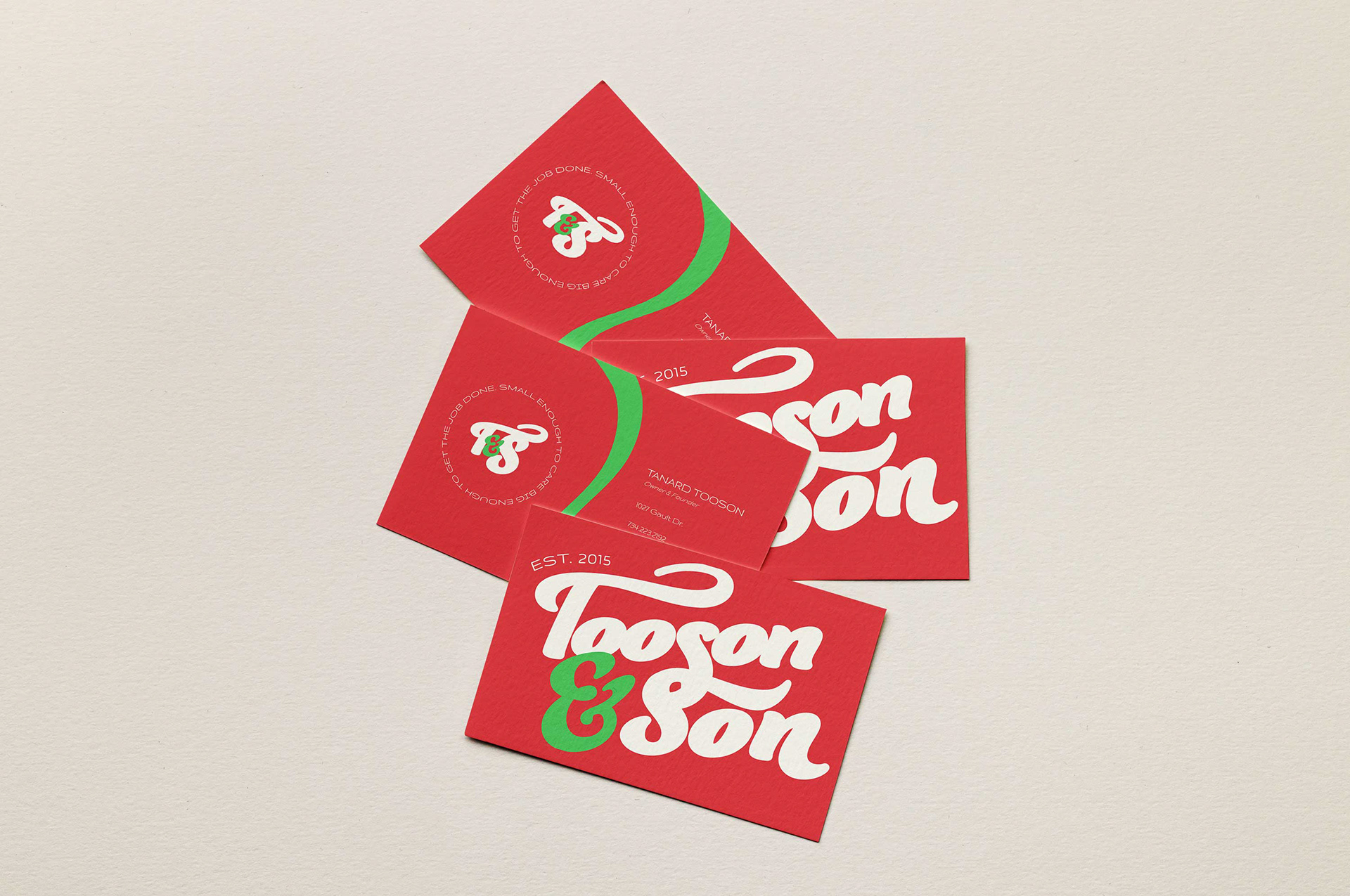
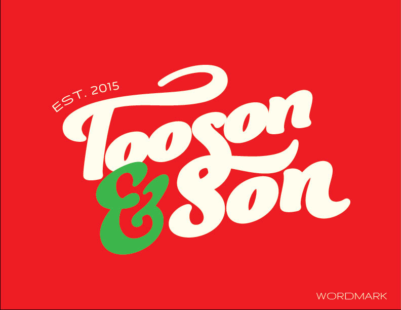
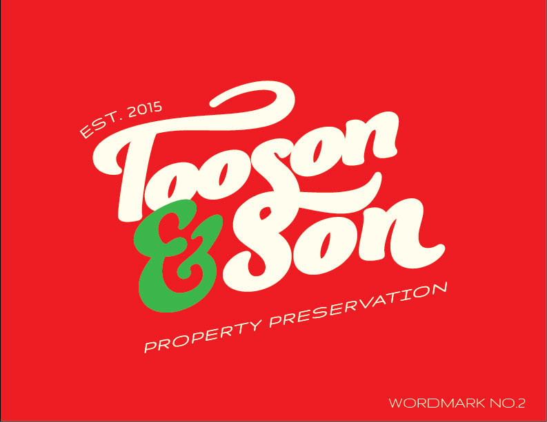
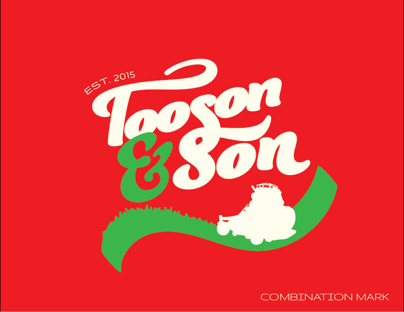
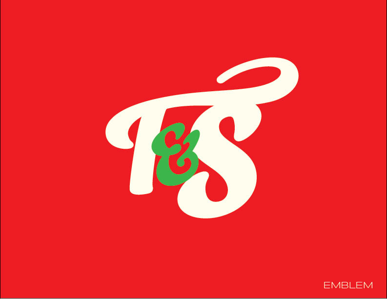
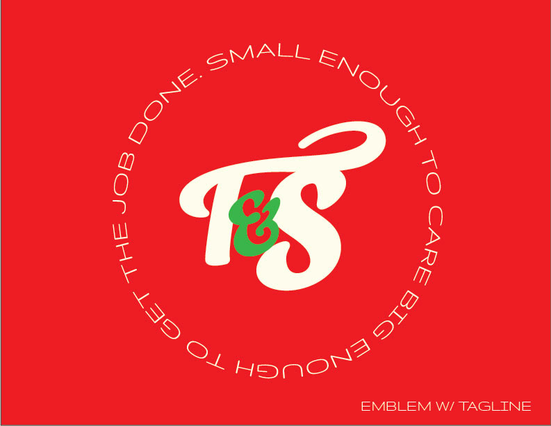
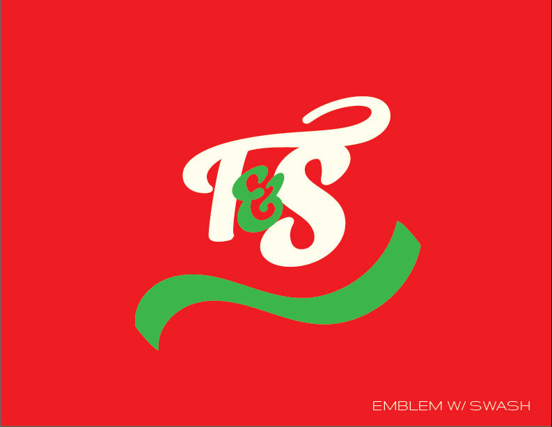
In the original logo, the 'T' in Tooson and the 'S' in Son were intertwined to symbolize the relationship between father and son. In the redesign, I used the swashes to recreate that feel in the wordmark, except using the 'S' in each letter instead of the 'T' and 'S'. In the emblem, the T's swash wraps around the 'S' like a father's arm around his son. The green swash is used as a representation of grass, as shown in the combination mark.