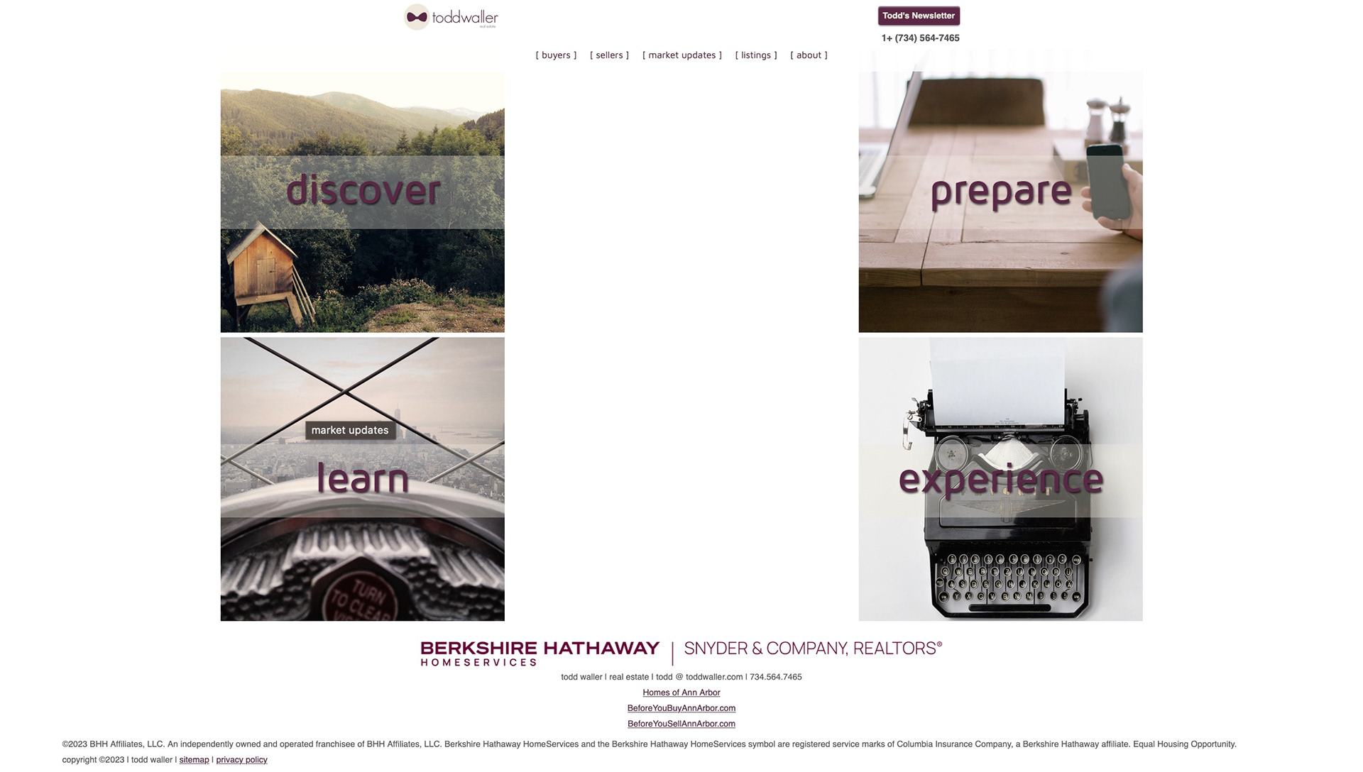
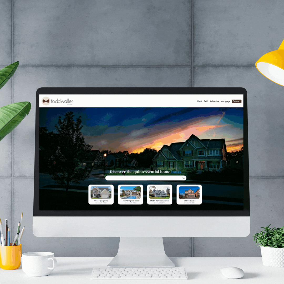
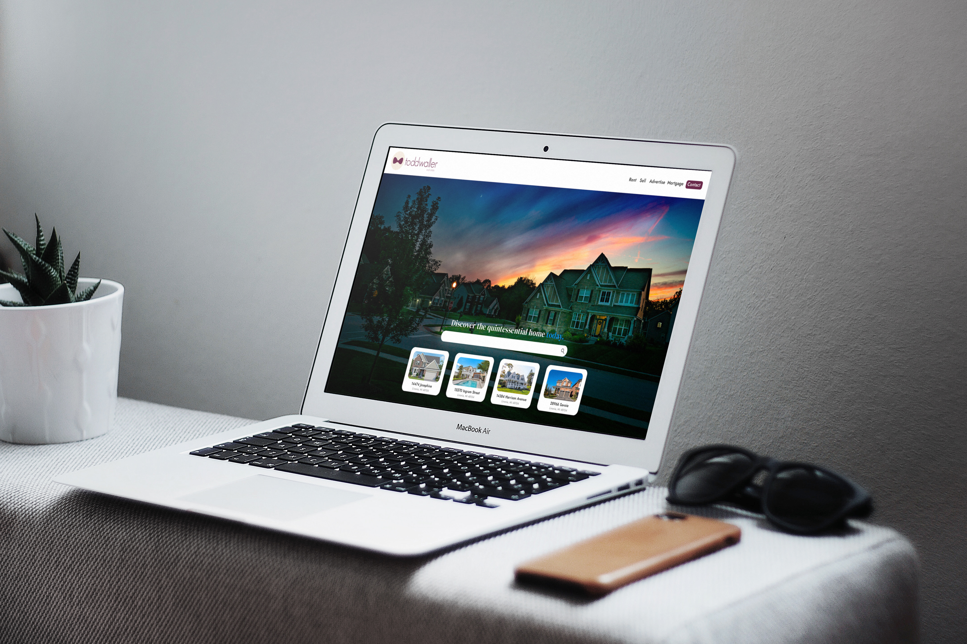
The landing page/hero image is inspired by popular real estate websites such as Zillow, Trulia, and Realtor. I pulled some of his listings that were on the website as well as made up some from the stock images to add extra content. The buckets and search bar allow for direct searches instead of scrolling through clicking/scrolling through multiple windows. The call to action paired with the hero image I wanted to feel helpful in a sense like Todd is giving you a tour through the website.
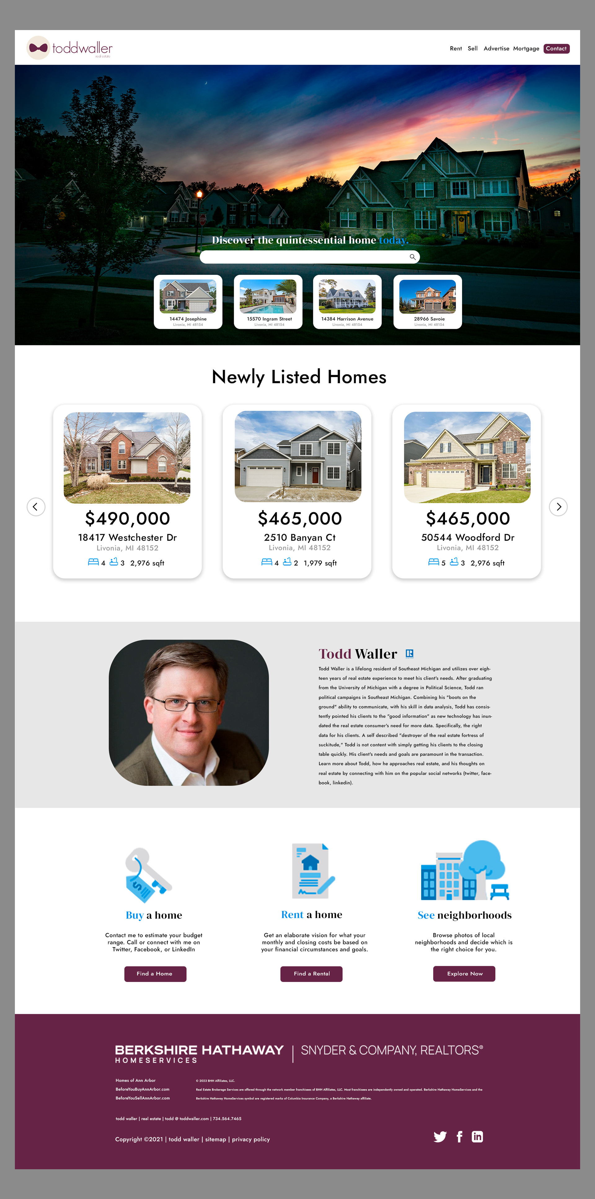
Along with an updated more modern design, I felt that what the website needed most was a more direct approach with its users. By having multiple listings readily available to scroll through on the main page and a few options tailored (i.e. buy, rent, view neighborhood) to each person looking for a home; my idea was to make the experience less monotonous overall. Since this is Todd's website I added a picture of him and some background information to make it more personal.